Update: Click here to watch a YouTube video about these dashboards.
I have greatly enjoyed working with Plotly and Dash, two powerful open-source Python visualization libraries. These tools allow users to create interactive charts and share them online.
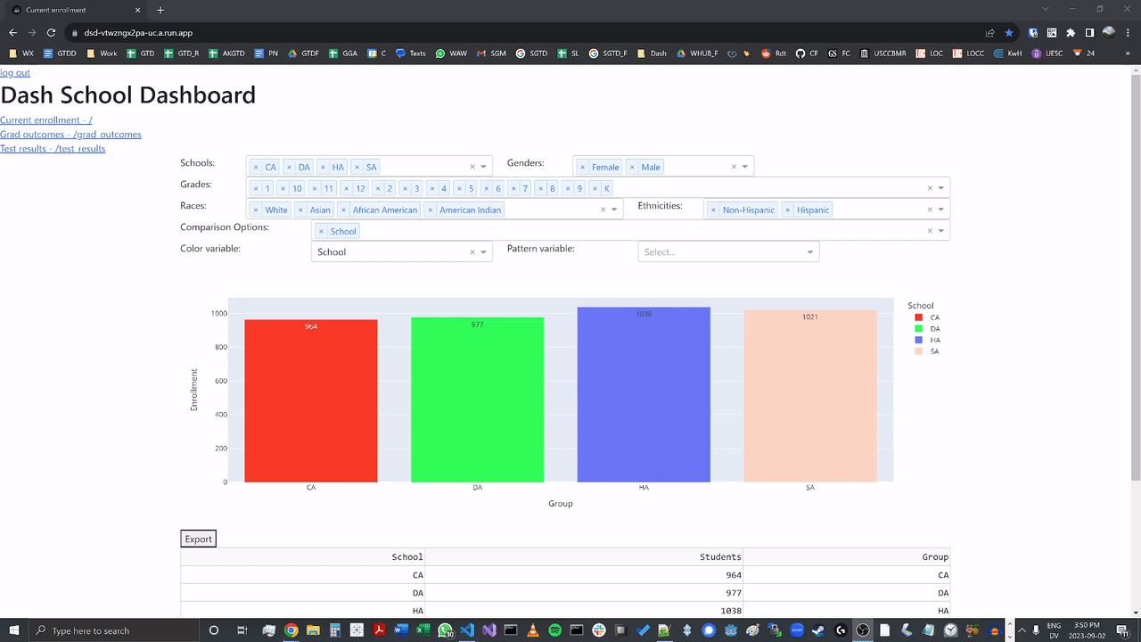
In order to practice using these libraries, I decided to create a set of interactive school dashboards. These dashboards, hosted on Google Cloud Run via this link, display fictional data for a made-up school district. The dashboard pages (which may take a little while to load) show enrollment counts, test results, and graduation outcomes for the district; in addition, they allow users to modify the filter and comparison settings to alter the appearance of the charts.
Here are some examples of the dashboards in use: (The article continues below the examples.)
Choosing how to compare data:

Changing dashboard filters:
Navigating between dashboards:

Setting color and pattern options:

Logging in and out:
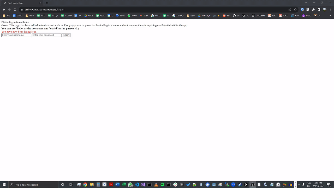
The dashboards also show how to implement login access for a Dash site. This login code, developed by Nader Elshehabi and Jinnyzor runs outside of the Dash app, which has a number of advantages. I am very grateful to both Nader and Jinnyzor for making their code available for other users to implement.
The project’s GitHub page contains a detailed readme that explains how I created these dashboards. This readme, along with the documentation contained within the app’s main code folder, will hopefully help other users create similar visualizations in Plotly and Dash. The project has been released under the MIT license, so you are welcome to use it for your own projects.
One advantage that my dashboard setup has over certain visualization methods is its cost effectiveness. Hosting the app on Cloud Run costs only pennies per month (if that) depending on how frequently the app is used. (In the past, I would have used Heroku to host an app like this, but Heroku’s pricing data indicates that it will cost at least $5 a month to run an app there. I do appreciate that Heroku has price caps for many of their hosting packages, so it could very well be the better option for you in case your Dash app is accessed frequently). Because Dash and Plotly are both open source, there’s no cost to using those packages, either. The login method I’m using is free as well. And finally, the ElephantSQL database that contains the data to be charted is also free. The more companies switch to SAAS (Software as a Service) pricing strategies, the better a deal a setup like this becomes in comparison!
I’m looking forward to continuing to apply Plotly and Dash, and I’m confident that this app’s code and documentation will be a helpful resource for me in the future. I hope that you will also find it beneficial in your own visualization endeavors!
